

Mobile Learning Lab: Designing for Mobile
Mark Byrne | Digital Marketing Specialist | Ward Technology Talent | Twitter | LinkedIn
Designing for Mobile
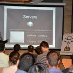
At last night’s Mobile Learning Lab we were delighted to have James Wu, Director of UX at Kobo join us to speak about his experience with UX and designing for mobile. James has designed products for products for iOS, Android, RIM and Kobo’s own eReader – so he certainly knows his stuff.
Before the session began we had a brief pitch from Matthew Fabb, an ambassador from FITC’s SCREENS conference who we’re proud to support. SCREENS is dedicated to covering development for mobile devices and operating systems. This conference, and optional workshop day, will give you the know-how to address client needs (and demands!) as we move forward into the mobile future. You can find out more about the conference here.
The core points addressed in James’ presentation were:
-
Screen real estate
-
Hardware variety
-
Touch UIs
-
Context of use
-
User expectations
-
User testing
Screen Real Estate
A standard monitor is about 212 square inches of space. The standard iPhone? You’re looking at 5.6 square inches of space. This difference is 3500%. Essentially this means that you’re going to need to spend a lot of time prioritizing what you want to do, what you want to design and what you want your user to do. When designing for mobile, task analysis becomes essential. The user should know what it is is that they should be doing – make it clear to them what this is.
You’re not going to be able to fit everything on the screen that your project manager is looking for so you’ll have to get used to telling them no and prioritizing what is needed most.
And just when you thought everything was worked out in terms of physical screen size, resolution and orientation of the screen you need to take into account the soft keyboard. How much this impacts will depend on the platform but it’s something that should be designed for.
Hardware Variety
The huge array of device types brings with it inherent problems. Mismatch in the hardware available different manufacturers makes it difficult to maintain consistency. Some devices will load slower, taps might not register while computation is being performed, will run out of memory or a whole host of other inconsistencies.
Removable SD storage is another issue to consider. Most devices use SD cards for expandable memory. People generally remove SD cards, assign a large chunk of it to storing images and the likes. You have to think about; what happens if the memory that you’re depending on is no longer there? How does your application respond?
Touch is a common interaction mechanism but you should also consider older interaction models like trackballs, hard keyboards and touch sensitive strips.
Speech, sound and radar based devices are interaction models that are coming down the pipeline. Can you leverage these?
Touch UIs
Essentially, when it comes to designing for mobile you can do two things. You can touch it, or you can see it. But you can’t do both, because when you touch something your hands get in the way. Many games in the App Store fall prey to this and become unplayable by trying to do the two at once.
What does that mean for design? This all depends on how the use will use the application. Is it one handed or two handed? Will they need to let go of the device to touch the centre of a 10 inch screen? Are there buttons on the side of the device to allow input?
There are no standards as of yet when it comes to touch interaction. There are the common, Apple inspired taps, swipes, pinch & expand but where do you stop? Would you benefit from a 5 finger crunch and stretch? Or a shake?
Less is always more, you want to keep things useful, discoverable and learnable.
Context of Use
Mobile application design brings with it the issue that, more often than not, people are not going to be sitting at a desk when using the application. They’re aren’t going to be in a perfect setting – it may be noisy or the WiFi may not be 100%. You may not have their full attention, they are probably on the go, they might be on mobile data – these are all things to be considered with your mobile design.
Data usage is another big consideration. Any app that costs an arm and a leg to update will be swiftly removed. How do you inform the user of updates and ensure that updates are down via WiFi?
User Expectations
To put it simply, there are few formal standards when it comes to designing for mobile. However, strong expectations exist across platforms. What is expected on iPhone may be unacceptable in Android and vice versa. Android users are accustomed to the native ‘Back’ button functionality that allows users to go backwards through the application’s screen stack. Not only is it a different model than available on iPhone, it has some non-intuitive behaviours that become ‘expected’ for those familiar with how it works.
User Testing
There are many options these days when it comes to testing your mobile design. Some popular examples include UserTesting.com and MagiTest.com. These platforms allow for user testing to take place remotely. They work by logging a user’s’ interaction with the mobile application or mobile website via the camera on the devices and by picking up on how they interact with your design.
While these are certainly options, James is a firm believer in the old fashioned, live testing. Even when viewing a user behind two-way glass you get a better feel of how your design is performing. Tools like MagiTest just don’t have quite the intimacy or impact of watching users struggle live in person
Key Takeaways
James concluded his presentation with the key takeaways that he wanted us to take from it when thinking about mobile design. They were:
1. Be conscious of the variability of devices.
2. Be conscious of the variability of users.
3. Test in person where possible.
Thanks to all those who came out to the Mobile Learning Lab and those who stayed around to chat after the presentation. If you haven’t already, you can join the Meetup Group here.
Looking forward to seeing you at the next session!

