

Simple and Flat, iOS 7 Signals Apple is Back
by Steve Buzinski, Director of Marketing + BD | Twitter | LinkedIn
No doubt that one of the world’s favorite companies has been on the decline. Since the untimely passing of Steve Jobs, Apple hasn’t quite looked the same nor has it been acting the same. Bursts of energy and enthusiasm at new product launches have been met with disappointment and modest changes at best. Naturally the public started to point fingers at Tim Cook and the company has in a sense plummeted to a point where many said it would never regain it’s spot as the most valuable company in the world.
But as one Globe writer said, I think that Monday’s release of iOS 7 at the WWDC marked the first day of the rest of Apple’s life. And for the first time since Job’s passing, the future is looking pretty bright in my eyes for the tech giant.
I’ll say that there are many opinions arguing both sides of this resurrection and the Apple VS. Android debate is certainly not one I’m hoping to fire up. However I wanted to highlight some of the key advancements in iOS 7 and give my 2 cents on how it will impact the general tone of Apple in the future.
Apple was plagued by a lack of innovation in recent years, the iPhone 5 launch was disappointing at best. With rumors of major innovations and possible NFC integration etc, it’s no doubt that the company fell short in this launch. Having said that, it’s still a gorgeous phone and with the thinner and more industrial design, few can argue that. Similarly, the Mac products saw hardware improvements and thinner designs but really, the once innovative company, that was disruptive for so many years before, seemed to have lost its mojo.
Admittedly, I’m an Apple fanboy but I think the recent releases at the WWDC was exactly what the sleeping giant needed to do to bring some life and swing into their step. Here’s some of my reasoning for why:
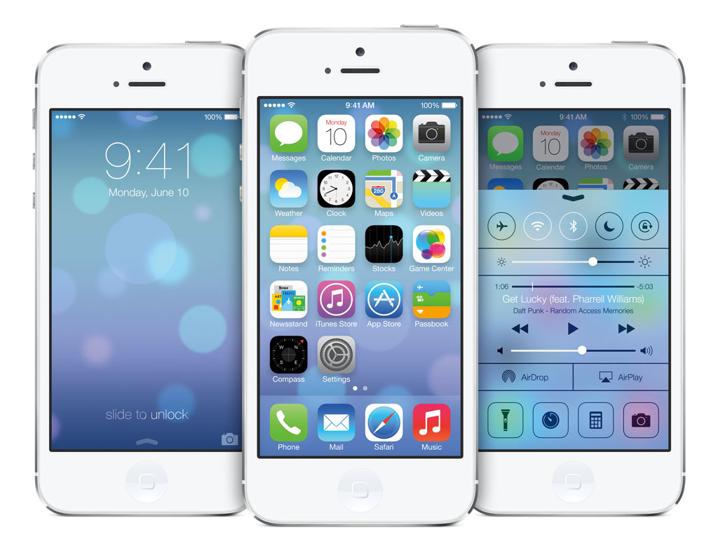
Clean and Simplistic UI
This may be one of my personal favorite trends in digital now (especially mobile) – flat and simple UI has really brought us back to the basics and made designers and users realize that simplicity is key. I think our applications were getting too complicated and graphically intense. When you see other companies like LinkedIn, HypeMachine and my personal favorite Rdio embracing this design trend with their heavy applications, no doubt it’s time for the keystone applications to follow suit.
Simple colors, simple fonts and minimalistic design is exactly what the dated design of the platform needed. Android has gone through multiple iterations (and their open operating system makes visual tweaks simple) so it was certainly time for a facelift.
As Jony Ives said in the launch, “Design defines so much of our experience, and there is a profound and enduring beauty in simplicity. True simplicity is derived from so much more than the absence of clutter. It’s about bringing order to complexity.”
The Launch of iRadio
Like I’ve detailed in my previous post on music applications, it was time for Apple to react to the growing importance of music services like Rdio, Spotify MOG and Pandora. Insert iTunes Radio. I will be blunt and say I don’t think that Apple has gone far enough to offer a service like those (because it would eat into their iTunes revenue – which is astronomical) but this is a good start.
Where they’ve missed the boat here is in appealing only to the discovery portion of the music listener. They’ve effectively gone face-to-face with Pandora (we will see who wins) but they haven’t quite acknowledged the fact that music listeners aren’t purchasing as much as they used to. They’re streaming and realizing that actually “owning” the music isn’t necessary…plus it’s only available in the US…
Like I mentioned, I don’t think they’re quite reacting enough to Spotify and the likes but I think this is a giant leap in the right direction.
The iTunes integration and the obvious revenue drive from music discovery can only be positive. Time will tell.
General Usability
With advancements like the improved notification center and the addition of the control center, they’ve made the user experience ultimately faster and more streamlined.
With additions like the flashlight button some have argued that Apple is actually discouraging innovation by adding features that we used to have to get through downloading third party applications. This may in theory be true, but if I can be bold, I think these tweaks are what will continue to keep iOS devices market share from falling – there’s no way around adding the best parts of other applications into the software.
Other advancements like Siri’s new male companion, the multitasking facelift, and the addition of airdrop into the OS has only made using the device more streamlined and simple. Adding features to an already robust environment is not always easy – you risk becoming a photoshop compared to paint. In my opinion, Apple has hit the nail on the head with these features and this iOS upgrade is exactly what they needed to do – there’s been no real movement on this since the phones inception in 2007.
Ultimately there’s no doubt in many minds that Apple has now merged a beautiful industrial design with a simplistic and powerful UI. Only time will tell whether this is what the company needed to maintain its sales and reignite user’s passion for the seemingly slipping firm.
To the nay-sayers I leave my own opinion in regard to the device: on innovation, I think it’s difficult to continue to innovate something near perfection. We don’t need to unlock our phones by waving our hands in front of them – Apple won’t play games with nice-to-haves and gimmicks, or so I hope.
This is a move to what Steve would appreciate – simple, beautiful and minimalistic.
We hope you found this blog post interesting, for more digital insight make sure to connect with our social media channels.


